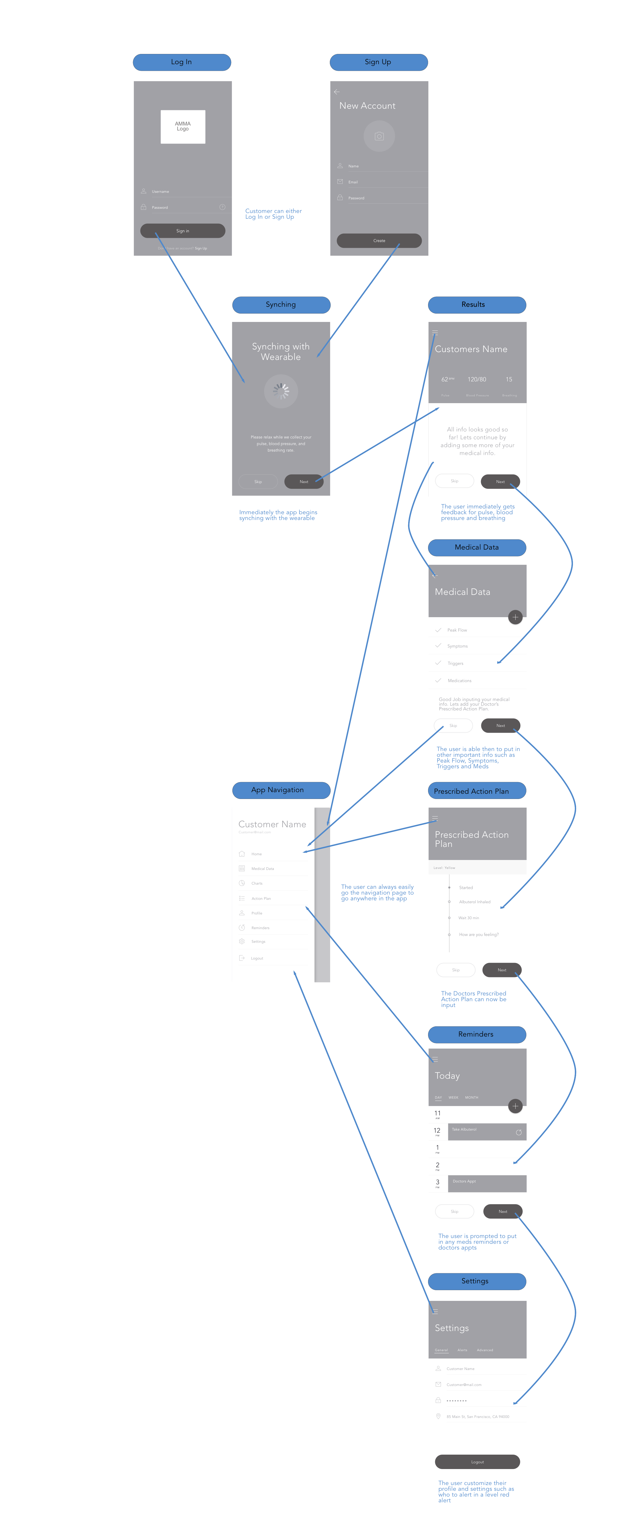
This is the app component to a corresponding wearable for health tracking and monitoring for asthma sufferers. The wearer would potentially be able to measure and then track breathing patterns, blood pressure, steps, sleep patterns, and other vitals in order to "learn" a person's health well enough to detect the signs of an oncoming asthma attack. The device would guide the user, then signal medical authorities and family members in the event of critical symptoms.
The goal was to create a working minimal viable product (MVP) prototype with the most important features that would be enhanced with further development.
Techniques: ethnographic research, workflows, design strategy, wireframes, user testing, high fidelity mockups, and prototype.
User Research Sessions
To begin, a visit was made to the local allergy and asthma clinic. After interviewing a couple of subject matter experts (SMEs), interviews were then conducted with actual asthma sufferers in their homes when possible. Special attention was paid to their individual problems, the tools used for tracking and prevention of symptoms, as well as the procedures followed during an actual attack.
Some of the interviews were very empathy invoking, but it wasn't until going through more secondary research that a chronic asthma sufferer was found having an actual attack while giving a video diary. This was a critical moment in the research process.
An important "ah-ha" moment when user needs are more clearly understood during an actual asthma attack.
Visioning
Several flow diagrams and storyboards were created to understand the caregiver or user monitoring the wearable. The other story was the user trying to learn about their newly discovered condition and use a tool to track and monitor.
User flow for onboarding and syncing app with wearable.
Personas were also important in understanding the motivations, goals and frustrations of both users. This product wasn't necessarily going to be used by just one person, so it was crucial to address both users needs.
Persona for a potentially very important and concerned secondary user-Tommy's mother.
Strategy and Documentation
In order to really "nail down" the fundamental challenges and focus areas a strategy blueprint was created. The aspiration was to make the product feel as if it "got" the user's frustrations and fears from the very beginning of diagnosis.
This Strategy Blueprint helped to determine what the "wow factor" should be with this product.
Now a minimal viable product could be focused on with second and third versions or iterations planned for the future.
The Product Roadmap for Ease helped show the initial priorities all the way to predicting through learning.
Implementation
It took several iterations of wireframes to get low fidelity mockups for user testing. It was important to get the basic flow implemented, in order to consider how to go about the early education program.
Wireframes helping to get a better idea of how the app was going to flow.
Styleguide used to choose the visual representation.
After some feedback it was time to make the high fidelity mockups so that a prototype for more complete user testing could be done.
In developing the visual identity of this app, consideration was given to the three things asthma sufferers wanted most: to feel more educated, to feel more in control, and to be empowered.


