EventRide
Recently I attended ProtoHack, a 12 hour hackathon for non-hackers. Ideation and prototyping were the goal, with the premise that you do not need to code in order to create something useful.
Techniques: brainstorming, researching, ideation, persona development, sketching, wireframes,
Ideation
With a team of three, we first had to brainstorm. No one had a pre-set project, so this was probably the most difficult part. Defining a problem and solution. We bounced ideas off of each other until we came up with something that felt would be beneficial to ourselves, and hopefully like minded others. We went with the idea of a ride sharing app for events, hence EventRide.
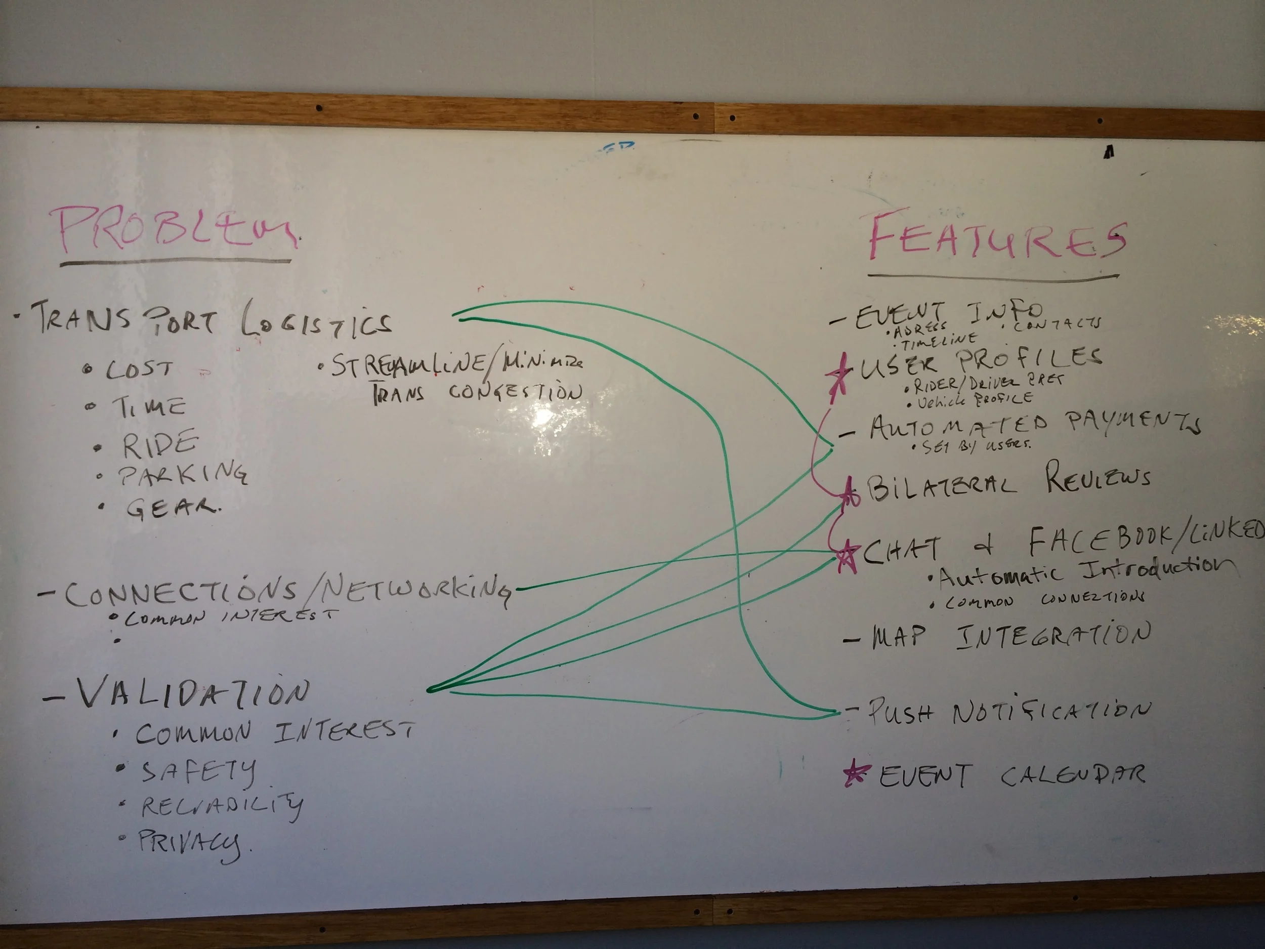
The clock ticking away, the whiteboard was filled with the problems getting to events. More head scratching, then the features that could be created to help with the difficulties.
Whiteboarding problems and potential features.
Research and Visioning
It was about this time that we had some time scheduled with a UX designer from Google. We asked what she thought of our idea. She looked me straight in the eye and asked, "what do your potential users say"?
Golden moment. Even in the middle of a highly intense, time limited, hackathon-of course, we needed to carefully consider our users. Immediately we set out to ask anyone that would give us a moment of their time about what their hurdles were in getting to this event and would EventRide be something helpful?
After we felt we had a handle on our user I went to putting together a persona for the rider, and a persona for the driver. This quick research and visualization was important in figuring out the MVP.
Personas for both the driver and the rider, helped us see better outside our own views.
Sketch
At this point, we went back to our feature set and prioritized. I set to sketching what the app might look like, and the user's story to be told for the presentation.
My quick sketched mockups.
Design
It was then that one of our team began to put final UI screens together as I continued to craft the story. It was challenging to keep it to 90 seconds or less.
Final UI designs for three key screens.
While we did not take home the grand prize, we felt pleased with the process, and were frankly impressed with how much we accomplished in only 12 hours. We also learned that those that came with a pre-planned idea obviously had more time to iterate. A lesson to be remembered for next time!


