GoodMarket
A challenge in testing user workflows and testing, particularly when logging in or signing up online. GoodMarket was a synthesis of several online "grocery to you" services. The task was to define the best flow and with user testing confirm which path was most efficient.
In addition, it was an exercise in studying current similar landing pages that seemed either a bit bland or complicated, and then freshening the look.
Techniques: sketching, wireframes, mockups, user testing (including A/B), assets
Workflow
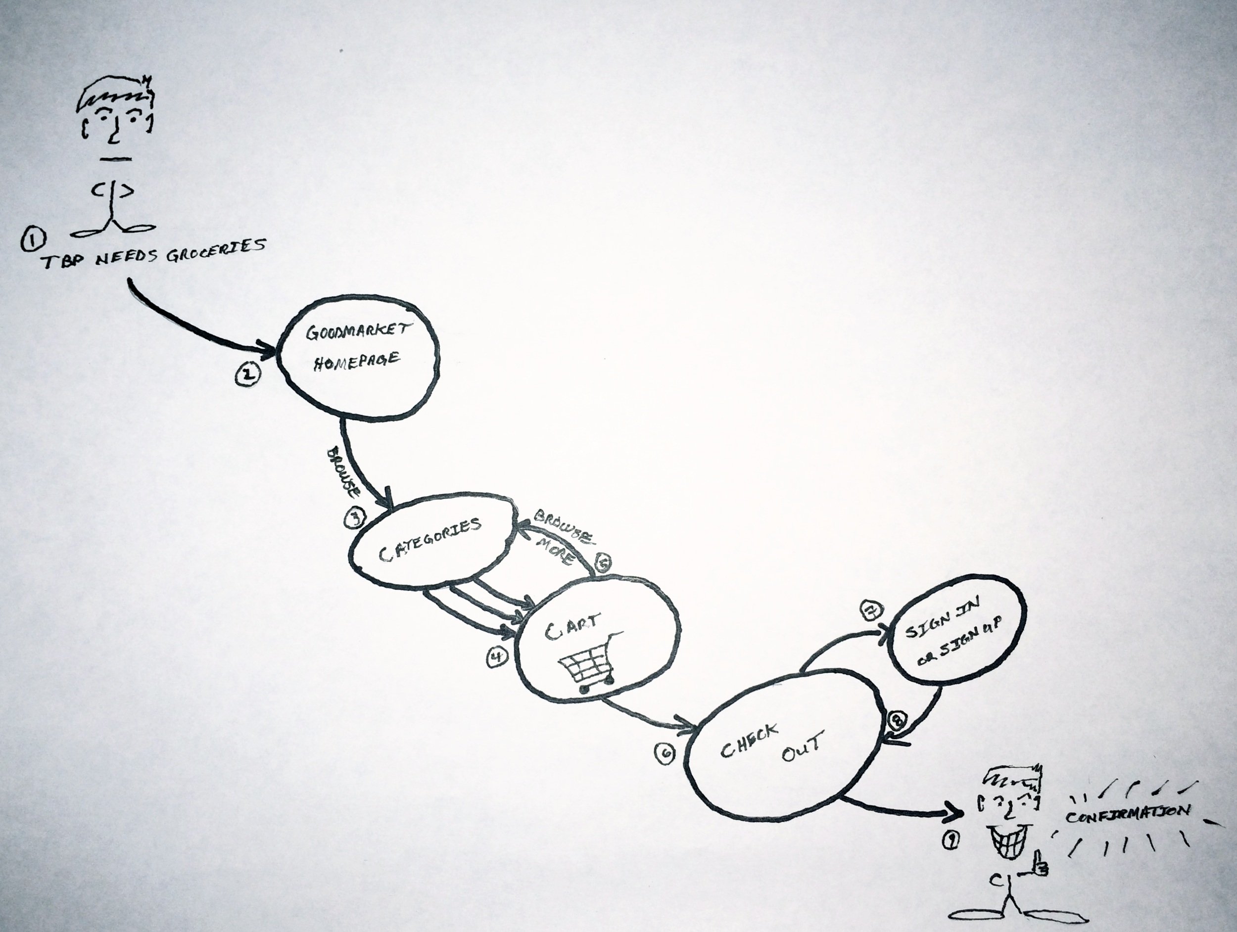
Drawing the flow seemed to be straight forward, but then questions began to arise as to whether signing in or signing up would be necessary before going to check out.
Quick workflow sketch for GoodMarket checkout.
User Testing
One of the tests was a simple login/signup test to see if it would be clearly understood where to sign up if you did not already have an account. After several iterations, the next step was to compare two of the best outcomes.
User testing with VerifyApp
A/B Testing
Several iterations of testing were needed due to the "all or nothing" nature of some of Usability Hub's tools. In the end there was a clear winner.
A/B Testing with Usability Hub
The Results
In order to simplify sign up, equal hierarchy was necessary to avoid confusion, and if the customer had strayed to the login screen first, a very identifiable path to sign up was implemented. Confirmation was determined to only be necessary at the next stage, but users could still check their cart contents at any time.
Final wireframes after testing.
Landing Redesign
In comparison to a majority of "grocery to you" sites most are either too bland or complicated, this design was meant to be straight- forward, and visually appealing. Several style guides were worked up as special attention was directed toward the typography, and layout hierarchy.
GoodMarket UI Redesign


